Panduan · 17 menit baca · 2,643 words
Grafik Garis, Batang, dan Candlestick: Memilih Jendela Anda ke Pasar
Memahami bagaimana harga divisualisasikan adalah hal mendasar; panduan ini menguraikan grafik garis, batang, dan candlestick untuk membantu Anda memilih alat yang tepat untuk analisis trading Anda.

Poin-poin penting
- Grafik garis paling baik untuk dengan cepat mengidentifikasi tren menyeluruh, karena hanya menghubungkan harga penutupan.
- Grafik batang memperkenalkan harga pembukaan, tertinggi, terendah, dan penutupan (OHLC), menawarkan detail lebih banyak daripada grafik garis.
- Grafik candlestick menawarkan informasi visual yang kaya, menampilkan data OHLC dengan body dan wicks yang jelas.
- 'Body' pada candlestick secara visual merepresentasikan rentang harga pembukaan dan penutupan, mengindikasikan tekanan beli atau jual.
- Timeframe trading Anda sangat memengaruhi jenis grafik mana yang akan paling efektif untuk analisis Anda.
- Untuk trading aktif dan analisis price action yang detail, grafik candlestick umumnya merupakan pilihan yang lebih unggul karena kekayaan visualnya.
Data Mentah Harga: Sungai Angka-Angka
Bayangkan Anda sedang mengamati sebuah sungai. Terkadang arusnya deras, terkadang lambat, dan kadang-kadang meluap. Dalam trading, harga bertindak seperti sungai itu, terus bergerak, pasang surut, dan mengalir. Pada setiap detik, ada harga 'bid' dan harga 'ask', yang merepresentasikan apa yang bersedia dibayar oleh pembeli dan apa yang bersedia diterima oleh penjual. Angka-angka kecil yang berkedip ini adalah bahan mentah pasar. Anda bisa mencoba trading hanya dengan mengamati angka-angka ini berkedip di layar, tetapi itu seperti mencoba memahami seluruh perjalanan sungai dengan melihat setetes air. Ini sangat membanjiri dan tidak memberikan konteks di mana harga telah berada, atau ke mana arahnya.
Untuk memahami fluktuasi yang konstan ini, trader menggunakan grafik. Sebuah grafik mengambil aliran data harga yang tak ada habisnya itu dan mengaturnya secara visual, memberikan Anda gambaran yang mudah dicerna tentang pergerakan pasar dari waktu ke waktu. Anggap saja sebagai peta sejarah sungai, menunjukkan jalur masa lalunya, titik-titik air tinggi, dan titik-titik rendahnya. Tanpa grafik, membuat keputusan yang tepat di pasar yang bergerak cepat seperti forex atau saham akan hampir mustahil. Otak Anda tidak dirancang untuk memproses jutaan individual price tick secara real-time dan mengekstrak pola yang bermakna.
Di sinilah tiga jenis grafik utama kita berperan: grafik garis, grafik batang, dan grafik candlestick. Masing-masing menyajikan informasi harga dasar yang sama, tetapi dengan cara yang sangat berbeda, menyoroti berbagai aspek cerita pasar. Pilihan Anda bukan hanya estetika; itu sangat memengaruhi apa yang Anda lihat, dan oleh karena itu, bagaimana Anda menafsirkan sentimen pasar dan potensi pergerakan di masa depan. Kita akan menjelajahi masing-masing, menguraikan apa yang mereka tunjukkan, dan yang lebih penting, apa yang tidak mereka tunjukkan.
Tampilan Paling Sederhana: Menghubungkan Titik-Titik dengan Grafik Garis
Grafik garis adalah bentuk visualisasi harga yang paling dasar, dan di sinilah banyak orang pertama kali bertemu dengan data keuangan. Ini hanyalah garis kontinu yang menghubungkan serangkaian titik data, biasanya harga penutupan untuk setiap periode. Jika Anda melihat grafik harian, misalnya, garis tersebut menghubungkan harga penutupan hari Senin, kemudian Selasa, kemudian Rabu, dan seterusnya.
Kekuatan utamanya terletak pada kesederhanaannya. Ketika Anda menyingkirkan semua informasi harga lainnya—harga tertinggi, terendah, harga pembukaan—Anda akan disajikan dengan tampilan tren yang sangat bersih. Apakah garis umumnya miring ke atas? Anda berada dalam uptrend. Ke bawah? Downtrend. Bergerak menyamping? Pasar ranging. Ini membuat grafik garis sangat baik untuk dengan cepat mengidentifikasi arah keseluruhan aset dalam periode yang lebih panjang, mungkin untuk analis fundamental yang tidak fokus pada pergerakan harga menit demi menit. Misalnya, jika Anda ingin melihat lintasan umum saham seperti Apple selama setahun terakhir, grafik garis memberi Anda gambaran besar itu tanpa kekacauan visual.
Namun, kesederhanaan ini juga merupakan kelemahan terbesarnya bagi trader aktif. Dengan hanya berfokus pada harga penutupan, grafik garis menyembunyikan banyak informasi penting tentang apa yang terjadi selama periode tersebut. Anda tidak tahu seberapa volatil sesi itu, seberapa jauh harga bergerak naik atau turun sebelum stabil, atau apakah ada tekanan jual yang signifikan yang akhirnya berhasil diatasi. Bagi seorang day trader yang perlu membuat keputusan dalam hitungan detik atau menit, kurangnya detail ini adalah batasan serius. Ini seperti hanya mengetahui di mana sungai berakhir setiap hari, tetapi tidak seberapa tinggi airnya naik atau seberapa rendah airnya surut di antaranya.
Menambahkan Detail: Informasi dalam Grafik Batang
Melangkah naik dari grafik garis, kita bertemu dengan grafik batang. Ini sering digambarkan sebagai grafik 'nyata' pertama karena memberikan detail yang jauh lebih banyak. Alih-alih hanya satu titik untuk harga penutupan, setiap periode pada grafik batang direpresentasikan oleh garis vertikal, atau 'batang'. Batang ini menangkap empat informasi kunci: harga Pembukaan (Open), Tertinggi (High), Terendah (Low), dan Penutupan (Close) (OHLC) untuk periode waktu tertentu.
Bagian atas batang vertikal menunjukkan harga tertinggi yang dicapai selama periode tersebut, sedangkan bagian bawah menunjukkan harga terendah. Harga pembukaan ditandai dengan tanda horizontal kecil atau 'sayap' di sisi kiri batang vertikal, dan harga penutupan adalah tanda serupa di sisi kanan. Jadi, satu batang memberi tahu Anda rentang pergerakan penuh, di mana harga dimulai, dan di mana harga berakhir dalam menit, jam, atau hari tertentu itu. Jika Anda menggunakan platform seperti MetaTrader 4 (MT4) atau TradingView, Anda dapat dengan mudah beralih antar jenis grafik untuk melihat transisi ini.
Detail tambahan ini sangat berharga. Misalnya, jika Anda melihat batang dengan lower shadow yang sangat panjang (artinya harga turun jauh lebih rendah dari harga penutupannya), itu memberi tahu Anda bahwa meskipun ada tekanan jual yang kuat selama periode tersebut, pembeli akhirnya masuk dan mendorong harga kembali naik. Ini adalah isyarat visual yang kuat yang tidak dapat disampaikan oleh grafik garis. Grafik batang menjadi populer untuk menampilkan informasi pasar jauh sebelum komputer umum digunakan, karena dapat digambar dengan tangan relatif mudah, mengemas banyak data dalam ruang kecil. Banyak trader profesional yang belajar keahlian mereka di era pra-digital masih sangat mengandalkan grafik batang untuk presentasi data OHLC yang jelas dan rapi.
Wawasan Lebih Dalam: Kisah Grafik Candlestick
Sekarang kita sampai pada grafik candlestick, bisa dibilang jenis grafik paling populer dan kaya visual di kalangan trader aktif saat ini. Berasal dari Jepang abad ke-18 untuk melacak harga beras, candlestick merangkum informasi OHLC yang sama dengan grafik batang tetapi menyajikannya dengan cara yang jauh lebih intuitif dan menarik secara visual. Alih-alih hanya garis vertikal dengan tanda, setiap periode direpresentasikan oleh 'candle'.
Sebuah candlestick memiliki 'body' dan dua 'wick' atau 'shadow'. Body candle menunjukkan rentang antara harga pembukaan dan penutupan. Jika harga penutupan lebih tinggi dari harga pembukaan, body biasanya berwarna hijau atau putih (menunjukkan pergerakan bullish, atau naik). Jika harga penutupan lebih rendah dari harga pembukaan, body biasanya berwarna merah atau hitam (menunjukkan pergerakan bearish, atau turun). Pengkodean warna instan ini memberikan umpan balik visual langsung tentang apakah pembeli atau penjual yang mengendalikan selama periode tersebut, sesuatu yang tidak ditawarkan grafik batang secara langsung.
Wick (atau shadow) yang memanjang dari atas dan bawah body merepresentasikan harga tertinggi dan terendah yang dicapai selama periode tersebut, sama seperti jangkauan sebuah batang. Upper wick menunjukkan harga tertinggi, dan lower wick menunjukkan harga terendah. Kombinasi warna body, ukuran body, dan panjang wick ini memungkinkan pengenalan pola yang cepat, memberikan wawasan tentang psikologi pasar. Ketika Anda melihat grafik candlestick, Anda tidak hanya melihat harga; Anda melihat sebuah cerita terungkap, dilukis dalam warna-warna yang segera memberi tahu Anda tentang sentimen pasar. Keunggulan visual ini adalah alasan utama mengapa platform seperti yang ditawarkan oleh Pepperstone atau IC Markets sering kali menggunakan grafik candlestick sebagai default bagi penggunanya.
Anatomi Candlestick: Apa yang Sebenarnya Ditunjukkannya
Mari kita uraikan satu candlestick untuk benar-benar menghargai kekayaan informasi yang diberikannya sekilas. Bayangkan sebuah candlestick 1 jam. Awal jam tersebut menandai harga 'Open'. Selama enam puluh menit, harga akan berfluktuasi, mencapai titik 'High' dan titik 'Low'. Ketika jam berakhir, harga terakhir adalah 'Close'.
Jika 'Close' berada di atas 'Open', candlestick akan memiliki body yang solid, biasanya hijau atau putih. Ini menandakan bahwa pembeli dominan, mendorong harga lebih tinggi selama jam tersebut. Semakin panjang body, semakin kuat tekanan beli. Jika 'Close' berada di bawah 'Open', body akan berongga atau merah/hitam, menunjukkan bahwa penjual yang mengendalikan. Wick (garis tipis yang memanjang dari body) menunjukkan titik tertinggi dan terendah absolut yang dicapai, bahkan jika harga tidak berhasil bertahan di sana. Upper wick yang panjang pada bearish candle, misalnya, memberi tahu Anda bahwa pembeli mencoba mendorong harga naik, tetapi penjual pada akhirnya menolak pergerakan itu dan menutupnya lebih rendah.
Ini adalah bagian yang dilewati sebagian besar panduan: kisah di dalam wick. Body yang sangat pendek dengan wick yang panjang, seperti 'Doji' atau 'Spinning Top', menandakan keraguan. Ini berarti baik pembeli maupun penjual mencoba mengambil kendali, tetapi tidak ada yang bisa mempertahankannya, dan harga ditutup di dekat harga pembukaan. Keraguan ini seringkali dapat mendahului pembalikan pasar atau kelanjutan setelah jeda. Memahami nuansa ini dari bentuk dan warna candle adalah keterampilan yang kuat yang dapat memakan waktu berbulan-bulan, atau bahkan bertahun-tahun, untuk benar-benar dikuasai. Ini tentang membaca denyut nadi pasar.
Perbandingan informasi yang ditampilkan oleh berbagai jenis grafik
| Fitur | Grafik Garis | Grafik Batang | Grafik Candlestick |
|---|---|---|---|
| Harga Penutupan | Ya | Ya | Ya |
| Harga Pembukaan | Tidak | Ya | Ya |
| Harga Tertinggi | Tidak | Ya | Ya |
| Harga Terendah | Tidak | Ya | Ya |
| Indikasi Bull/Bear Instan | Tidak | Tidak | Ya (melalui warna badan) |
| Representasi Visual Badan | Tidak | Tidak | Ya |
Bagi siapa pun yang terlibat dalam trading aktif, grafik candlestick umumnya merupakan pilihan yang lebih unggul karena perbedaan visualnya yang langsung antara periode bullish dan bearish.
Membaca Cerita: Pola Candlestick Dasar
Setelah Anda memahami anatomi satu candlestick, Anda bisa mulai menyusun narasi dengan melihat pola dua atau lebih candle. Pola-pola ini bukanlah prediksi magis, melainkan representasi visual dari pergeseran sentimen pasar. Sebagai contoh, candle 'Marubozu', yang tidak memiliki sumbu (wick), menunjukkan keyakinan ekstrem: Marubozu bullish berarti pembeli mengendalikan pasar dari pembukaan hingga penutupan, sementara Marubozu bearish menunjukkan penjual mendominasi sepenuhnya. Tidak ada perlawanan, tidak ada keraguan.
Kemudian ada pola 'Hammer' dan 'Hanging Man'. Hammer, yang ditemukan di dasar tren turun (downtrend), memiliki badan kecil (seringkali bullish) dan sumbu bawah (lower wick) yang panjang. Ini menunjukkan bahwa penjual menekan harga ke bawah, tetapi pembeli masuk dengan kuat dan mendorongnya kembali ke atas, mengindikasikan potensi pembalikan (reversal). Kebalikannya, Hanging Man, muncul di puncak tren naik (uptrend) dan mengindikasikan hal sebaliknya: pembeli mencoba, tetapi penjual mendorong kembali. Ini hanyalah beberapa contoh, dan ada puluhan pola yang dikenal, masing-masing dengan implikasi spesifiknya sendiri untuk arah pasar. Kuncinya bukanlah menghafal semuanya secara instan, tetapi memahami psikologi yang mendasarinya.
Perlu diingat bahwa meskipun pola-pola ini membantu, mereka tidak selalu sempurna. Pola-pola ini paling baik digunakan bersamaan dengan alat analisis teknikal lainnya dan dalam konteks tren pasar yang lebih luas. Mengandalkan hanya pada satu pola candlestick bisa menyesatkan; ini seperti mencoba memahami seluruh percakapan hanya dengan mendengar satu kata. Selalu pertimbangkan candle di sekitarnya dan lingkungan pasar secara keseluruhan.
Timeframe dan Gaya Trading Anda: Pilihan Krusial
Pilihan jenis grafik juga perlu selaras dengan timeframe trading dan gaya pribadi Anda. Apakah Anda seorang day trader, yang membuka dan menutup posisi dalam hitungan menit atau jam? Atau apakah Anda seorang swing trader, yang menahan posisi selama berhari-hari atau berminggu-minggu? Mungkin Anda adalah investor jangka panjang, yang melihat tren bulanan atau bahkan tahunan. Setiap pendekatan mendapatkan manfaat dari tingkat detail yang berbeda dan tampilan grafik yang spesifik.
Untuk trading jangka pendek, misalnya pada grafik 1-menit atau 5-menit, candlestick hampir secara universal lebih disukai. Keputusan cepat yang diperlukan dalam scalping atau day trading menuntut umpan balik visual instan yang disediakan oleh warna dan bentuk candle. Melewatkan harga pembukaan (open), tertinggi (high), dan terendah (low), atau pergeseran cepat dari momentum bullish ke bearish, bisa berarti melewatkan titik masuk atau keluar yang menguntungkan. Broker seperti XM dan OANDA menyediakan opsi timeframe yang sangat detail ini di seluruh platform mereka, mengakui beragam kebutuhan trader aktif.
Bagi investor jangka panjang yang melihat grafik mingguan atau bulanan, grafik garis (line chart) mungkin sudah cukup untuk mengukur tren keseluruhan, karena fluktuasi menit demi menit menjadi 'noise' (gangguan) daripada 'signal' (sinyal). Misalnya, jika Anda menilai tren makro pasangan mata uang seperti EUR/USD, grafik garis yang berasal dari harga penutupan harian selama beberapa bulan memberikan gambaran yang jelas tentang arah umumnya tanpa kekacauan volatilitas intraday. Oleh karena itu, grafik yang Anda pilih adalah fungsi dari pertanyaan yang Anda ajukan kepada pasar.
Mencocokkan jenis grafik dengan gaya trading dan timeframe yang berbeda
| Gaya Trading | Timeframe Umum | Jenis Grafik yang Direkomendasikan | Alasan |
|---|---|---|---|
| Scalping | 1-menit, 5-menit | Candlestick | Detail maksimum untuk keputusan cepat, petunjuk sentimen visual. |
| Day Trading | 15-menit, 1-jam | Candlestick | Detail OHLC, pengenalan pola untuk pergerakan intraday. |
| Swing Trading | 4-jam, Harian | Candlestick/Bar | Keseimbangan detail dan tren, kurang sensitif terhadap fluktuasi kecil. |
| Position Trading | Mingguan, Bulanan | Bar/Garis | Fokus pada tren yang lebih luas, minim 'noise' intraday, OHLC tetap berguna. |
| Investasi Jangka Panjang | Bulanan, Tahunan | Garis | Gambaran jelas arah umum, gangguan minimal. |
Mengapa Candlestick Unggul untuk Perdagangan Aktif
Meskipun grafik garis dan bar tentu memiliki tempatnya, bagi siapa pun yang terlibat dalam perdagangan aktif – baik itu day trading, swing trading, atau bahkan pendekatan metodis untuk posisi jangka panjang – grafik candlestick umumnya merupakan pilihan yang lebih unggul. Perbedaan visual langsung antara periode bullish dan bearish, yang disampaikan oleh warna 'body' (badan) candlestick, memberikan Anda gambaran instan tentang sentimen pasar yang tidak ada pada grafik bar.
Pertimbangkan ini: pada grafik bar, Anda harus secara mental membandingkan 'tick' kiri (harga pembukaan) dengan 'tick' kanan (harga penutupan) untuk menentukan apakah periode tersebut naik atau turun. Dengan candlestick, cukup dengan sekali lihat. Hijau berarti naik, merah berarti turun. Ini mungkin tampak seperti keuntungan kecil, tetapi di pasar yang bergerak cepat di mana keputusan perlu dibuat dalam sepersekian detik, pengenalan instan tersebut mengurangi beban kognitif dan memungkinkan Anda memproses informasi lebih efisien. Kemampuan membaca cepat inilah mengapa platform seperti eToro dan FxPro sangat mengandalkan candlestick.
Sejarah panjang pengembangan pola candlestick juga menyediakan "kosakata" yang kaya untuk memahami dinamika pasar. Pola-pola seperti engulfing bars, pin bars, dan morning/evening stars menawarkan petunjuk kuat tentang potensi pembalikan atau kelanjutan tren. Meskipun beberapa orang mungkin merasa jumlah pola yang begitu banyak pada awalnya menakutkan, fokus pada beberapa pola dengan probabilitas tinggi, seperti yang menunjukkan kelelahan setelah pergerakan kuat, dapat secara signifikan meningkatkan analisis Anda. Kemampuan untuk menyampaikan aksi harga yang kompleks dalam format visual yang mudah dicerna ini memberikan candlestick keunggulan yang jelas dibandingkan rekan-rekannya yang lebih sederhana, terutama bila dikombinasikan dengan indikator teknikal.
Peralatan Perdagangan: Platform dan Indikator
Apa pun jenis grafik yang Anda sukai, Anda akan melihatnya di platform trading. Platform seperti MetaTrader 4 (MT4), MetaTrader 5 (MT5), dan TradingView adalah standar industri, tersedia secara luas melalui broker seperti AvaTrade, Exness, dan FOREX.com. Platform ini memungkinkan Anda beralih dengan mudah antara grafik garis, bar, dan candlestick hanya dengan satu klik, memberikan fleksibilitas kepada trader dengan pendekatan analitis yang berbeda. Fleksibilitas ini berarti Anda tidak harus terpaku pada satu jenis saja; Anda dapat menggunakan grafik garis untuk identifikasi tren makro, lalu beralih ke grafik candlestick untuk menyempurnakan titik masuk dan keluar Anda.
Grafik benar-benar menjadi hidup ketika dikombinasikan dengan indikator teknikal. Ini adalah perhitungan matematis berdasarkan data harga atau volume historis, yang diplot langsung pada grafik atau di jendela terpisah. Misalnya, Moving Average (MA) dapat ditumpangkan pada jenis grafik apa pun untuk menghaluskan aksi harga dan mengidentifikasi tren, sementara Relative Strength Index (RSI) mungkin diplot di bawah untuk mengukur momentum. Kejelasan visual grafik candlestick membuatnya sangat cocok untuk integrasi dengan indikator. Melihat pola candlestick berkembang tepat di level Moving Average yang penting, misalnya, memberikan sinyal yang jauh lebih kuat daripada mengamati skenario yang sama pada grafik garis yang kurang detail.
Platform canggih juga memungkinkan kustomisasi, memungkinkan Anda mengubah warna candle, tema latar belakang, dan menambahkan berbagai alat gambar seperti garis tren, Fibonacci retracements, dan level support/resistance. Menjadi mahir dengan perangkat lunak charting Anda sama pentingnya dengan memahami jenis grafik itu sendiri. Luangkan waktu untuk menjelajahi fitur-fiturnya; grafik yang dikonfigurasi dengan baik dapat secara signifikan meningkatkan alur kerja analitis Anda.
Elemen Manusia: Latihan dan Persepsi
Pada akhirnya, jenis grafik 'terbaik' adalah yang paling sesuai dengan psikologi trading individual Anda dan membantu Anda membuat keputusan paling jelas. Meskipun candlestick menawarkan informasi terbanyak untuk trading aktif, beberapa trader berpengalaman masih lebih menyukai garis bersih grafik bar, merasa bahwa 'body' dan warna candlestick terlalu mengganggu. Tidak ada jawaban tunggal yang benar secara universal, tetapi ada keuntungan yang umumnya diterima untuk trader aktif.
Trik sebenarnya bukan hanya mengetahui apa yang ditunjukkan setiap grafik; ini tentang meluangkan waktu di depan layar untuk mengembangkan 'mata' Anda terhadap aksi harga. Sama seperti seorang seniman belajar melihat cahaya dan shadow, seorang trader belajar melihat pola dan nuansa dalam data grafik. Ini membutuhkan latihan yang konsisten, meninjau grafik historis, dan mengamati bagaimana berbagai jenis grafik menyajikan peristiwa pasar yang sama. Anda mungkin mulai dengan mengidentifikasi tren kuat pada grafik garis, lalu memperbesar ke timeframe yang lebih rendah dengan candlestick untuk menentukan titik masuk. Bereksperimenlah, bermain-main dengan pengaturan yang berbeda, dan lihat apa yang membantu Anda 'membaca' pasar paling efektif.
Perangkat lunak charting Anda, baik itu platform web dari Plus500 atau versi desktop MT5, hanyalah sebuah alat. Kemampuan Anda untuk menafsirkan apa yang ditampilkannya adalah keterampilan yang sebenarnya. Jangan takut untuk beralih antar grafik selama analisis Anda. Misalnya, gunakan grafik garis harian untuk mengkonfirmasi tren jangka panjang, lalu beralih ke grafik candlestick 4 jam untuk mengidentifikasi aksi harga jangka pendek dan potensi titik masuk. Pendekatan multi-grafik ini sering kali memberikan analisis paling efektif, menggabungkan gambaran besar dengan detail granular yang diperlukan untuk eksekusi.
Baca sumber utama
Periksa di regulator, bukan pada kami
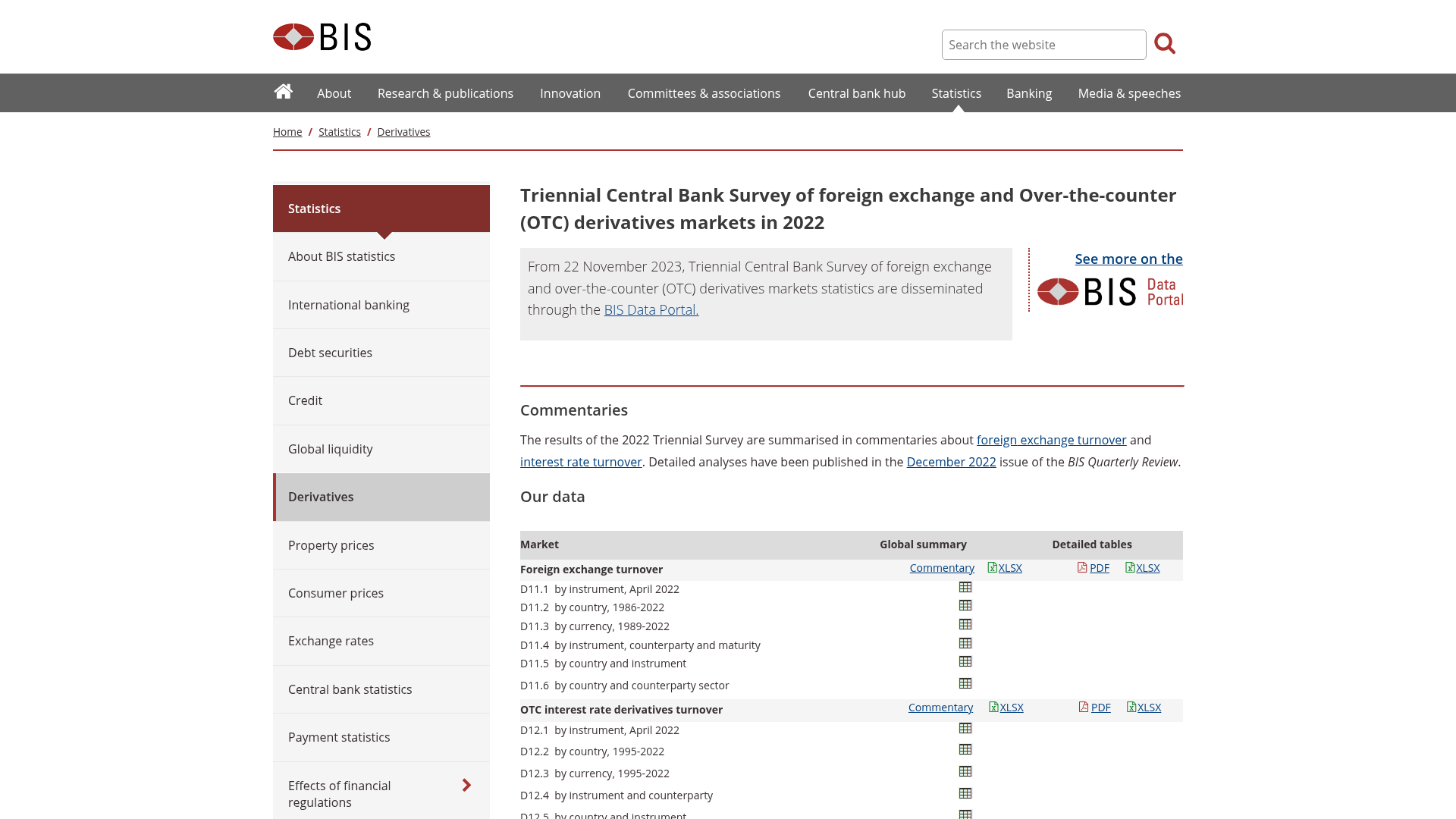
Tangkapan layar halaman resmi di balik aturan dalam panduan ini. Buka sendiri — kata-kata regulator sendiri selalu lebih baik daripada ringkasannya.
Sering ditanyakan
Sumber
Dari mana ini berasal
Ditulis oleh Sofia Reyes
Tutor Risiko & Psikologi. Kami menulis edukasi forex yang terstruktur, dalam bahasa Inggris sederhana untuk orang yang belajar dari awal. Pemahaman dulu, selalu — dan tidak pernah nasihat keuangan. Kursus itu sendiri ada di kurikulum.
Terus belajar
Ke mana panduan ini mengarah selanjutnya
Panduan yang paling dekat dengan ini, sesuai urutan pembangunannya. Masing-masing adalah bacaan lengkap tersendiri, dan tidak ada yang berasumsi Anda telah menyelesaikan halaman ini.
- Membaca Grafik Candlestick Dari Nol MutlakPelajari cara menafsirkan grafik candlestick, bahasa visual harga pasar, dengan panduan ramah pemula ini untuk memahami price…
- Kebenaran Tentang Sumbu Panjang: Apa yang Mereka Katakan, dan Apa yang TidakPelajari cara menafsirkan sumbu candlestick sebagai catatan visual penolakan harga dan sentimen pasar, tetapi pahami keterbatasan…
- Candle Engulfing: Mekanika Daripada KeajaibanPelajari mekanika sederhana dari pola candlestick engulfing bullish dan bearish serta cara menggabungkannya ke dalam strategi…
- Candle Indecision: Membaca Pola Doji Tanpa Mengarang CeritaPelajari cara menafsirkan pola candlestick doji sebagai ketidakpastian pasar yang sebenarnya, daripada langsung menyimpulkan…
- Menguasai Konteks Pasar: Mengapa Timeframe yang Lebih Tinggi Menentukan Keberhasilan EntryBanyak trader mengabaikan konteks krusial yang disediakan oleh timeframe yang lebih tinggi, sering kali menyebabkan kerugian yang…