دليل · 14 دقيقة قراءة · 2,171 words
قراءة منحنى حقوق الملكية الخاص بك: اكتشاف الانحراف المبكر
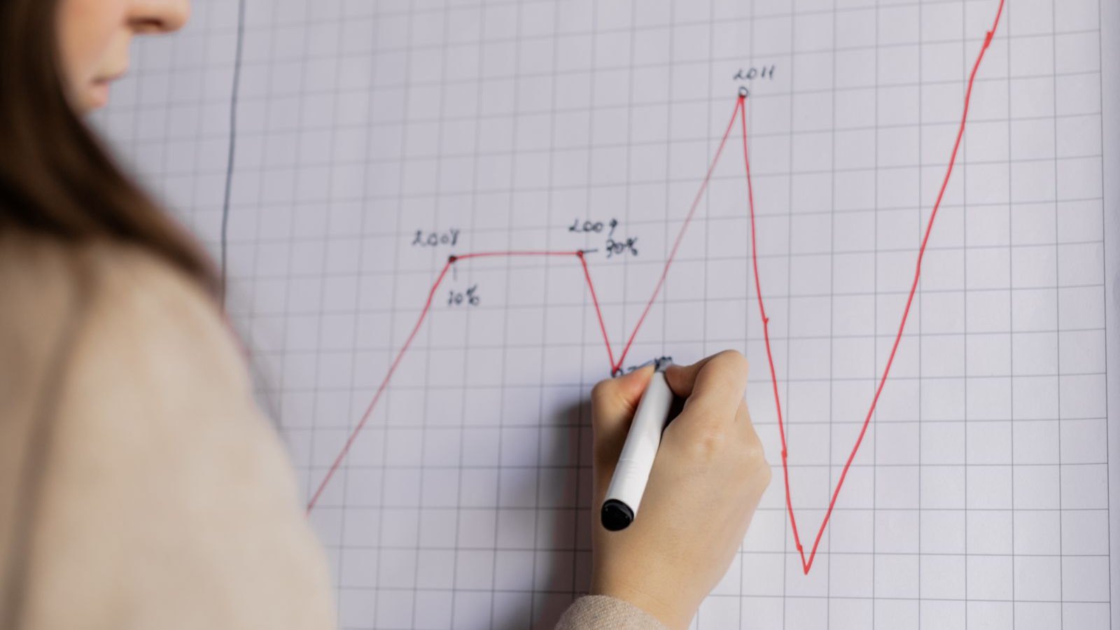
منحنى حقوق الملكية للمتداول هو أكثر من مجرد رسم بياني للأداء؛ إنه أداة تشخيصية تكشف عن تحولات دقيقة في ميزة تداولك قبل وقت طويل من أن تصبح مكلفة.
أهم النقاط
- يعكس منحنى حقوق الملكية الخاص بك مباشرة صحة استراتيجية تداولك، وليس فقط أرباحها.
- يمكن للتغييرات الدقيقة في ميل المنحنى أو سلاسته أن تشير إلى "انحراف" في ظروف السوق أو في تنفيذك.
- يتيح لك الاكتشاف المبكر للانحراف إجراء تعديلات استراتيجية قبل حدوث تآكل كبير لرأس المال.
- يعد التتبع المستمر والتحليل النقدي لفترات التراجع أمرًا بالغ الأهمية لبقاء التداول على المدى الطويل.
- تساعد المقاييس الرئيسية مثل نسبة MAR وعامل الربح في قياس الصحة والكفاءة الحقيقية لمنحنى حقوق الملكية الخاص بك.
- غالبًا ما يعني "انقطاع" مستمر في منحنى حقوق الملكية الخاص بك أن بيئة تداولك قد تغيرت بشكل جوهري، مما يتطلب مراجعة الاستراتيجية.
الراوي الصامت: منحنى حقوق الملكية الخاص بك
تخيل أنك تقود سيارة، وبدلاً من مجرد عداد سرعة، لديك لوحة تعرض الصحة العامة لمحرك سيارتك، وتآكل إطاراتك، ومدى كفاءة استخدامك للوقود. هذا هو ما يمثله منحنى حقوق الملكية للمتداول. يلقي معظم الناس نظرة على بيان الربح والخسارة (P&L) الخاص بهم، ويرون أرقامًا خضراء، ويشعرون بالرضا. لكن بيان الربح والخسارة الخاص بك هو مجرد الوجهة؛ بينما يوضح لك منحنى حقوق الملكية الخاص بك رحلة الطريق بأكملها، بما في ذلك جميع المطبات، والانعطافات، ومدى سلاسة قيادتك.
منحنى حقوق الملكية الخاص بك هو رسم بياني خطي يوضح رأس مالك مقابل الوقت. إنه يعكس رصيد حسابك بعد كل صفقة، مع الأخذ في الاعتبار الأرباح والخسائر المحققة وغير المحققة. يشير المنحنى الصاعد إلى الربحية، بينما يشير المنحنى الهابط إلى الخسائر. لكن السحر الحقيقي لا يكمن فقط في الاتجاه؛ بل في الشكل، والسلاسة، والاتساق لهذا الخط. هذا التاريخ المرئي هو سجل قوي وغير متحيز لأداء تداولك، وأكثر دلالة بكثير من نتيجة أي صفقة واحدة.
بصفتي مرشدك، أريدك أن تبدأ في رؤية منحنى حقوق الملكية الخاص بك ليس كلوحة نتائج، بل كتقرير تشخيصي. إنه وثيقة حية تهمس بأسرار حول فعالية استراتيجيتك، وانضباطك، وحتى التحولات الدقيقة في الأسواق التي تتداول فيها. يمكن أن يوفر لك تعلم تفسير هذه الهمسات مبكرًا الكثير من رأس المال والمعاناة في المستقبل. الأمر يتعلق بالإدارة الاستباقية، وليس الذعر كرد فعل.
كيف يبدو المنحنى الصحي (وما هو ليس "انحرافًا")
يتميز منحنى حقوق الملكية الصحي بميل صاعد وسلس بشكل عام، يشبه صعود تلة لطيف بدلاً من أفعوانية. إنه يظهر مكاسب متسقة، مع تراجعات—تلك الانخفاضات المؤقتة في رأس المال—تكون ضحلة ويتم استردادها بسرعة. فكر في الأمر كطريق مُصان جيدًا: المطبات الصغيرة العرضية طبيعية، لكن الحفر العميقة أو المنحدرات المفاجئة ليست كذلك. يشير هذا التقدم السلس إلى أن ميزة تداولك قوية، وأن إدارة مخاطرك فعالة، وأن استراتيجيتك تتوافق جيدًا مع ظروف السوق الحالية.
الآن، ما هو ليس "انحرافًا"؟ ستتسبب تقلبات السوق العادية دائمًا في تذبذب منحنى حقوق الملكية الخاص بك. لن يكون المنحنى الصحي خطًا مستقيمًا تمامًا للأعلى؛ ستكون هناك تراجعات صغيرة. غالبًا ما تكون هذه مجرد حركات السوق الطبيعية، أو التباين الطبيعي الذي يأتي مع أي ميزة إحصائية. ومع ذلك، فإن "الانحراف" مختلف. إنه تغيير مستمر، وغالبًا ما يكون دقيقًا، في طبيعة المنحنى يشير إلى أن شيئًا جوهريًا قد تغير. إنه مثل سيارتك التي تبدأ فجأة في الميل قليلاً إلى جانب واحد، أو كفاءة استهلاك الوقود لديك تتدهور باطراد دون سبب واضح.
لا يتعلق الأمر هنا بإلقاء اللوم على السوق أو على نفسك؛ بل يتعلق بالملاحظة. يخبرك المنحنى الصحي أن نهجك متزامن مع السوق. عندما يبدأ هذا التزامن في التذبذب، فهذا هو الانحراف. إنه يتطلب اهتمامك لأن تجاهله يشبه تجاهل ضوء فحص المحرك—سيؤدي فقط إلى مشاكل أكبر وأكثر تكلفة لاحقًا. هذه الملاحظة الاستباقية هي سمة مميزة للتداول الاحترافي حقًا.
تشريح الانحراف: علامات تحذير دقيقة
يتطلب التعرف على الانحراف عينًا ثاقبة. نادرًا ما يعلن عن نفسه بانهيار مفاجئ. بدلاً من ذلك، غالبًا ما يبدأ بتحولات دقيقة في نمط منحنى حقوق الملكية الخاص بك. إحدى العلامات الشائعة هي ميل مسطح: قد يظل منحنى حقوق الملكية الخاص بك في ارتفاع، ولكن بوتيرة أبطأ بشكل ملحوظ، حتى لو لم تتغير وتيرة تداولاتك. يشير هذا إلى أن صفقاتك الرابحة ليست مربحة بنفس القدر، أو أن صفقاتك الخاسرة أكبر قليلاً.
مؤشر آخر هو تزايد التذبذب أو التقلب. قد يتذبذب منحنى حقوق الملكية الخاص بك بشكل أكثر جنونًا، مع تراجعات أعمق وأكثر تكرارًا، حتى لو تعافيت في النهاية إلى مستويات قياسية جديدة. يوضح هذا أن ميزتك قد تصبح غير متسقة، أو أنك تواجه ظروف سوق معاكسة. فكر في الأمر كقيادة على طريق يصبح أكثر وعورة وأقل قابلية للتنبؤ، ويتطلب المزيد من الجهد للبقاء على المسار. أخيرًا، راقب نمط الدرج الهابط. هذا هو المكان الذي تتبع فيه المكاسب الصغيرة باستمرار خسائر أكبر، مما يؤدي إلى تآكل صافي لرأس المال بمرور الوقت. قد تبدو كل خطوة هبوطية بسيطة، ولكنها مجتمعة ترسم صورة واضحة لاستراتيجية تفقد أساسها.
هذه الإشارات البصرية هي خط دفاعك الأول. إنها تخبرك أن السوق الذي تتداول فيه، أو الطريقة التي تتداول بها، لم يعد ينتج النتائج المتوقعة. إنها حافز للتحقيق، وليس للذعر. يفوّت العديد من المتداولين هذه التحذيرات المبكرة، ويتفاعلون فقط عندما يكون المنحنى قد تلقى ضربة كبيرة بالفعل، ويكون رأس المال قد تآكل بشكل كبير.
ما وراء المرئيات: قياس الانحراف بالمقاييس
بينما الفحص البصري مفيد، فإن دمجه مع المقاييس الكمية يوفر تقييمًا أكثر موضوعية لصحة منحنى حقوق الملكية الخاص بك. اثنان من المقاييس القوية هما عامل الربح ونسبة MAR. يقيس عامل الربح نسبة الأرباح الإجمالية إلى الخسائر الإجمالية. يشير عامل أعلى من 1.0 إلى الربحية، ولكن الاستراتيجية الناجحة غالبًا ما تهدف إلى 1.5 أو أعلى. يُعد عامل الربح المتناقص، حتى لو كان لا يزال أعلى من 1.0، إشارة قوية للانحراف.
نسبة MAR (المعروفة أيضًا باسم نسبة Calmar أو نسبة النمو السنوي المركب / الحد الأقصى للتراجع) مفيدة بشكل خاص لتقييم العوائد المعدلة حسب المخاطر. إنها تقارن معدل النمو السنوي المركب (CAGR) لرأس مالك بحد أقصى للتراجع الخاص بك. تشير نسبة MAR أعلى إلى عوائد أفضل بالنسبة للمخاطر المتخذة. إذا بدأت نسبة MAR الخاصة بك في الانخفاض، فهذا يعني أنك تخاطر أكثر للحصول على نفس العائد، أو تحصل على عائد أقل لنفس المخاطرة، وهي علامة كلاسيكية لانحراف الاستراتيجية. توفر هذه المقاييس أرقامًا ملموسة يمكن أن تؤكد ما قد تخبرك به عيناك حول سلوك منحنى حقوق الملكية الخاص بك. إنها تساعدك على تجاوز المشاعر الغريزية واتخاذ قرارات تستند إلى البيانات.
يمكن أن يوفر حساب هذه المقاييس بانتظام—شهريًا أو ربع سنويًا على سبيل المثال—ومقارنتها بمتوسطاتك التاريخية أو معاييرك المثالية تحذيرات واضحة لا لبس فيها بأن انحرافًا قيد الحدوث. لا يتعلق الأمر فقط بمعرفة أرقامك؛ بل يتعلق بمعرفة ماذا تعني التغييرات في تلك الأرقام لمستقبل تداولك.
المقاييس الرئيسية لقياس صحة منحنى حقوق الملكية واكتشاف الانحراف
| المقياس | طريقة الحساب | التفسير |
|---|---|---|
| عامل الربح | إجمالي الربح / إجمالي الخسارة | تشير القيمة فوق 1.0 إلى الربحية؛ وغالبًا ما تُعتبر القيمة فوق 1.5 قوية. يشير الانخفاض في القيمة إلى الانجراف. |
| نسبة MAR (مبسطة) | العائد السنوي / أقصى تراجع (القيمة المطلقة) | كلما ارتفعت كان أفضل. يشير الانخفاض إلى زيادة المخاطر مقابل نفس العائد، أو انخفاض الكفاءة. |
منحنى حقوق الملكية الخاص بك هو وثيقة حية تهمس بأسرار حول فعالية استراتيجيتك، وانضباطك، وحتى التحولات الدقيقة في الأسواق التي تتداول فيها.
سيكولوجية منحنى رأس المال المنجرف
عندما يبدأ منحنى رأس مالك في الانجراف، لا تتأثر أرقامك فقط؛ بل يتأثر جانبك النفسي أيضًا. غالبًا ما يكون الرد الأولي هو الإنكار. قد تقول لنفسك، 'إنها مجرد فترة صعبة،' أو 'السوق سينتعش.' قد يؤدي هذا الإنكار إلى التقاعس، مما يسمح للانجراف بالتفاقم. ومع تراكم الخسائر، يتسلل الإحباط، مما يؤدي أحيانًا إلى سلوكيات متهورة مثل 'التداول الانتقامي' – الدخول في صفقات أكبر وأقل بحثًا في محاولة لاسترداد الخسائر بسرعة.
هذا فخ خطير. يمكن أن يؤدي العبء العاطفي للانجراف المستمر إلى انهيار في الانضباط، حيث تبدأ في الانحراف عن خطة التداول المحددة مسبقًا. قد تطارد الصفقات، أو توسع أوامر وقف الخسارة، أو تفرط في التداول، معتقدًا أن المزيد من النشاط سيحل المشكلة بطريقة ما. بدلاً من ذلك، تصب هذه الإجراءات الزيت على النار، مما يسرع من تآكل رأس المال. هذه الدورة من الإنكار والإحباط والتداول المتهور هي نبوءة ذاتية التحقق لمزيد من الخسائر.
الحل ليس في تجاهل مشاعرك، بل في التعرف عليها ووضع خطة محددة مسبقًا لما يجب فعله عندما يشير منحنى رأس مالك إلى وجود مشكلة. وهذا يعني التحلي بالانضباط للتراجع، حتى عندما يرغب كل جزء منك في التداول أكثر. بصفتي مرشدًا في التداول، يمكنني أن أخبرك أن المتداولين الأكثر نجاحًا ليسوا عديمي المشاعر؛ بل هم ببساطة أفضل في إدارة استجاباتهم العاطفية لرد فعل السوق، خاصة عندما يكون هذا الرد سلبيًا.
أصول الانجراف: تحولات السوق مقابل أخطاء المتداول
بمجرد تحديدك للانجراف، تتمثل الخطوة الحاسمة التالية في معرفة سببه. بشكل عام، ينبع الانجراف من أحد مصدرين رئيسيين: تحولات السوق الخارجية أو أخطاء المتداول الداخلية. تشمل تحولات السوق التغيرات في التقلبات، والتحولات في أنظمة السوق (مثل الانتقال من الاتجاهي إلى النطاقي)، وإصدارات البيانات الاقتصادية الجديدة، أو الأحداث الجيوسياسية التي تغير بشكل أساسي سلوك الأصول. على سبيل المثال، إذا كانت استراتيجيتك تعتمد على اتجاهات ثابتة، فإن التحول المفاجئ إلى حركة سعرية جانبية سيؤدي إلى تسطح أو انخفاض منحنى رأس مالك، حتى لو كان تنفيذك لا تشوبه شائبة. هذا ليس خطأك؛ بل هو خطأ السوق.
من ناحية أخرى، تقع أخطاء المتداول بالكامل تحت سيطرتك. ويشمل ذلك الانحرافات عن خطة التداول الخاصة بك (مثل الدخول في صفقات لا تستوفي معاييرك)، أو إدارة المخاطر السيئة (مثل أحجام المراكز غير المتناسقة أو أوامر وقف الخسارة الأوسع مما هو مخطط له)، أو ببساطة انهيار في الانضباط بسبب عوامل عاطفية. على سبيل المثال، إذا كنت تحرك أمر وقف الخسارة باستمرار عندما تسير الصفقة ضدك، فسيزداد متوسط خسارتك، مما يتسبب في انجراف منحنى رأس مالك نحو الأسفل، بغض النظر عن ظروف السوق. من الضروري التمييز بصدق بين هذين الأمرين، لأن الإجراءات التصحيحية مختلفة جدًا. لا يمكنك تغيير السوق، ولكن يمكنك بالتأكيد تغيير سلوكك الخاص.
يصبح سجل تداولاتك لا غنى عنه هنا. ستساعد مراجعة صفقاتك الأخيرة بعين موضوعية، ومقارنتها بقواعد استراتيجيتك، والبحث عن أنماط في عملية اتخاذ القرار لديك، في تحديد المصدر الحقيقي للانجراف. لا تخف من الاعتراف إذا كانت المشكلة تكمن في تنفيذك أو انضباطك؛ فهذه هي الخطوة الأولى لإصلاحها.
التمييز بين انجراف منحنى رأس المال الناتج عن السوق والانجراف الناتج عن المتداول
| نوع السبب | مؤشرات شائعة | مثال |
|---|---|---|
| تحول السوق | تراجع مفاجئ في أداء الاستراتيجية عبر فئات أصول متعددة؛ زيادة الإشارات الخاطئة؛ تغيرات غير متوقعة في التقلبات. | استراتيجية تتبع الاتجاه تواجه صعوبة في سوق EUR/USD جديد يتسم بالحركة الجانبية بعد إعلان من البنك المركزي. |
| خطأ المتداول | أحجام صفقات غير متناسقة؛ تحريك أوامر وقف الخسارة بشكل متكرر؛ الدخول في صفقات خارج قواعد الخطة؛ اتخاذ قرارات عاطفية. | الدخول باستمرار في صفقات بمخاطر أكبر من المسموح بها بعد بضع صفقات خاسرة، مما يؤدي إلى تراجعات أكبر. |
إعادة ضبط مسارك: خطوات عملية عند حدوث الانجراف
بمجرد تحديد الانجراف وتحديد سببه، يحين وقت اتخاذ إجراء حاسم. أولاً، وهذا لا يمكن المبالغة فيه: أوقف التداول مؤقتًا. قلل أحجام مراكزك بشكل كبير، أو انتقل إلى حساب تجريبي لفترة. هذا يوقف النزيف على الفور ويزيل الضغط العاطفي للمال الحقيقي على المحك. فكر في الأمر على أنه التوقف على جانب الطريق لفحص المحرك.
بعد ذلك، أجرِ مراجعة شاملة لاستراتيجيتك. عد إلى سجل تداولاتك. حلل آخر 20-50 صفقة بالتفصيل. هل كنت تتبع قواعدك؟ هل تغيرت ظروف السوق؟ ما هو متوسط ربحك/خسارتك، وكيف قارن بأدائك التاريخي؟ أعد تقييم استراتيجيتك مقابل بيانات السوق الحالية. إذا كانت ميزة استراتيجيتك تعتمد على خصائص سوق معينة لم تعد موجودة (مثل التقلبات المنخفضة، الاتجاهات القوية)، فقد تحتاج إلى التكيف أو حتى الاستبدال.
أخيرًا، نفذ مرحلة 'التداول التشخيصي'. هذا يعني التداول بمخاطر قليلة، مع التركيز فقط على اختبار الفرضيات حول ما قد يسبب الانجراف. على سبيل المثال، إذا كنت تشك في أن تقلبات السوق قد تغيرت، اختبر استراتيجيتك على إطار زمني أصغر أو بمعلمات وقف خسارة معدلة. هذا ليس الهدف منه كسب المال؛ بل هو جمع البيانات لتأكيد تشخيصك وإيجاد حل قابل للتطبيق. فقط عندما ترى منحنى رأس مالك يتحسن باستمرار، حتى على نطاق صغير، يجب أن تزيد تعرضك للمخاطر تدريجيًا مرة أخرى.
دور الوسيط: جودة التنفيذ وسلامة البيانات
من السهل التركيز فقط على استراتيجيتك وإجراءاتك الخاصة، ولكن جودة تنفيذ وسيطك وبياناته يمكن أن تلعب أيضًا دورًا دقيقًا، ولكنه مهم، في انحراف منحنى الأرباح. يضمن التنفيذ السريع والموثوق به، مع أقل slippage و spreads ضيقة، تحقيق أسعار الدخول والخروج المستهدفة. أما التنفيذ السيئ، الذي يتميز بإعادة تسعير متكررة، أو spreads أوسع مما هو معلن، أو slippage كبير، فيمكن أن يقوض ميزتك التنافسية ببطء بمرور الوقت، مما يتسبب في انحراف منحنى الأرباح الخاص بك نحو الأسفل، حتى لو كانت استراتيجيتك سليمة نظريًا. وهذا ينطبق بشكل خاص على استراتيجيات التداول عالي التردد أو المضاربة اللحظية (scalping) حيث كل pip مهم.
فكر في وسطاء مثل Pepperstone، الذي يركز على 'التنفيذ السريع و spreads الضيقة'، أو IC Markets، الذي يروج لتداول 'آمن وموثوق' مع 'قوة لتداولات أفضل'. تشير هذه الادعاءات إلى أهمية جودة التنفيذ. وبينما هذه التصريحات هي تسويقية، فإن التزام الوسيط بهذه الجوانب أمر بالغ الأهمية. كما أن سلامة تدفق بياناتك حيوية؛ فتغذية الأسعار غير الدقيقة أو المتأخرة يمكن أن تؤدي إلى قرارات دخول وخروج خاطئة، مما يؤثر على أدائك العام. عمليًا، غالبًا ما يطلب منك مكتب التداول تقديم لقطات شاشة أو سجلات تداول إذا اشتكيت من slippage مستمر، لذا احتفظ بسجلات دقيقة. هذا هو الجزء الذي تتجاهله معظم الأدلة، بافتراض أن جميع الوسطاء متساوون، لكنهم بالتأكيد ليسوا كذلك.
راجع أداء وسيطك بشكل دوري. قارن أسعارك المنفذة بمتوسط السوق، وراقب أي slippage سلبي مستمر. إذا وجدت باستمرار أن نتائجك الفعلية تختلف عن نتائجك المختبرة (backtested) أو المتوقعة بسبب التنفيذ، فقد يكون الوقت قد حان للتفكير فيما إذا كان وسيطك يساهم في انحراف منحنى أرباحك. الوسيط شريك في تداولك، ومثل أي شراكة، يجب على كلا الطرفين الالتزام بمسؤولياتهما.
اليقظة طويلة الأمد: منع الانحرافات المستقبلية
إن عمل تحليل منحنى الأرباح الخاص بك ليس حلاً لمرة واحدة؛ إنه عملية مستمرة. لمنع الانحرافات المستقبلية، ادمج تحليل منحنى الأرباح في روتين تداولك المنتظم. خصص وقتًا محددًا كل أسبوع أو شهر – على سبيل المثال، كل مساء أحد لمدة 30 دقيقة – لمراجعة تقدم منحنى الأرباح الخاص بك، وإعادة حساب مقاييسك الرئيسية، ومقارنتها بمعاييرك المرجعية. يعمل هذا الفحص الدوري كنظام إنذار مبكر، مما يتيح لك اكتشاف التغييرات الطفيفة قبل أن تتفاقم إلى مشاكل أكبر. تمامًا كما أنك لن تتجاهل ضوءًا يومض في لوحة قيادة سيارتك، لا تتجاهل التحولات الطفيفة في أداء تداولك.
ابنِ حلقة تغذية راجعة مستمرة. عندما تحدد انحرافًا محتملاً، اتبع الخطوات التشخيصية الموضحة سابقًا. عندما تجري تعديلات، تتبع تأثيرها على منحنى أرباحك. إذا نجح التعديل، قم بدمجه. وإذا لم ينجح، جرب شيئًا آخر. هذه العملية المتكررة من الملاحظة، الفرضية، الاختبار، والتعديل هي كيفية صقل ميزتك التداولية والتكيف مع سوق دائم التغير. إن انضباط المراجعة والتكيف المستمر هذا هو ما يميز المتداولين الناجحين عن أولئك الذين يعانون.
منحنى أرباحك هو أصدق انعكاس لرحلتك التداولية. من خلال تعلم قراءة إشاراته الدقيقة والعمل بتحذيراته، تكتسب أداة لا تقدر بثمن للتقييم الذاتي والتحسين المستمر. حافظ على صعود هذا الخط، وتذكر: التحسينات الصغيرة المستمرة أكثر قيمة بكثير من المكاسب الكبيرة المتفرقة. مستقبلك في التداول يعتمد على يقظتك اليوم.
اقرأ المصدر الأساسي
تحقق من ذلك لدى الجهة التنظيمية، وليس لدينا
لقطات شاشة للصفحات الرسمية التي تستند إليها القواعد في هذا الدليل. افتحها بنفسك — فكلمات الجهة التنظيمية نفسها دائمًا ما تكون أفضل من ملخص لها.
الأسئلة المتكررة
المصادر
من أين جاء هذا
بقلم Elena Marsh
مدرب رئيسي. نقدم تعليماً منظماً ومبسطاً في الفوركس باللغة الإنجليزية للأشخاص الذين يتعلمون من الصفر. الفهم أولاً، دائماً — وليس نصيحة مالية أبداً. الدورة التدريبية نفسها موجودة في الـ المناهج.
واصل التعلم
إلى أين يقود هذا الدليل لاحقاً
الأدلة الأقرب إلى هذا الدليل، بالترتيب الذي تبني عليه. كل منها قراءة كاملة بحد ذاتها، ولا يفترض أي منها أنك انتهيت من هذه الصفحة.
- استراتيجية في حالة ركود: التمييز بين نظام تداول راكد ونظام معطلتعلم كيفية معرفة ما إذا كانت استراتيجية تداولك تمر فقط بـ drawdown مؤقت أو توقفت عن العمل بشكل أساسي، لحماية رأس مالك…
- Profit Factor: ما يخبرك به حقًا (وما يخفيه بصمت)يقدم مقياس Profit Factor نظرة سريعة على صحة نظام التداول الخاص بك، ولكن الاعتماد عليه وحده يمكن أن يخفي عيوب الأداء الحرجة ويؤدي…
- التداول عبر العاصفة: التعامل مع سلاسل الخسائر دون تدمير نظامك بالكاملسلاسل الخسارة يمكن أن تهز حتى المتداولين الأكثر خبرة. تعلّم كيف تشخص المشكلات بشكل منهجي وتجري تعديلات دقيقة، بدلاً من التغييرات…
- بطاقة تقريرك الشهرية: ستة أرقام يجب على كل متداول تتبعهايُعد قياس أدائك التجاري شهريًا أمرًا بالغ الأهمية. يكشف هذا الدليل عن ستة أرقام أساسية يجب على كل متداول تتبعها لتحديد نقاط القوة،…
- الإفراط في التداول: ثلاث علامات تحذيرية وإجراءك الأسبوعي المضاداكتشف الأنماط الخفية للإفراط في التداول، وافهم تكاليفه الحقيقية، وتعلّم طريقة تدقيق أسبوعية بسيطة لاستعادة السيطرة وبناء عادات…